During the summer of 2017, I interned with Viget, a full-service digital agency based in Durham, Falls Church, and Boulder. Over the course of the internship I learned valuable design principles alongside industry professionals, and was able to put my newfound skills to the test through a collaborative intern project. to build a responsive web application dedicated to helping users make better coffee with less effort. 
My role as the design intern was to define the visual identity of Ground Rules and collaborate with the UX and front-end developer interns to create a streamlined user flow, as well as conduct user research. Our work at the end of the 8-week project culminated a presentation of the built-out product to Viget Labs.
Time Frame
June-August 2017
Skills Utilized
UI/UX Design, Visual Design, User Research, Illustration, Motion Design
The Challenge: 
Casual coffee drinkers are unsatisfied with the monotony of the way they currently experience caffeine consumption, but are too busy with their work/personal lives to feel that they can actively go out of their way to search for new coffee types and experiences. 
The Solution: 
A responsive web app that consolidates information about coffee ground types and solutions to common coffee machine issues in an efficient, interactive, and entertaining experience for users, reducing the amount of time it takes for casual coffee drinkers to learn actionable solutions for improving their caffeination experience.
Research & Ideation
To better understand our users and the underlying reasons behind their perceived tedium of caffeine consumption, we conducted in-person interviews and gathered online survey data regarding casual coffee drinkers' as-is experience, contexts, and challenges. 
Our core user in this prompt was the everyday drinker of coffee -- not a connoisseur or an absolute addict, but people often working office jobs who were used to drinking coffee for workplace caffeination or casual enjoyment on a weekly to daily basis. We developed a user persona based on our research that reflected these goals and needs. 
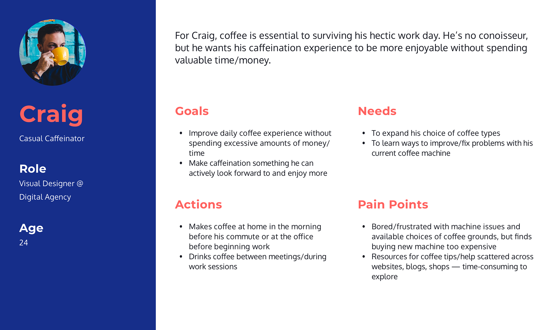
Our user's needs and Pain Points: 
1. Casual drinkers prioritize ease/convenience over absolute quality. It's not about making great coffee, it's about making good coffee without having to work for it. 
2. Casual coffee drinkers are often too busy with addressing everyday work and life needs to put aside a significant amount of time to addressing their qualms with their current coffee-drinking experience. 
3. Out of the above qualms, the most significant problems people have with their current caffeination experience are: 
      a. Boredom with current coffee ground choices -- desire to find new roast types and recommendations
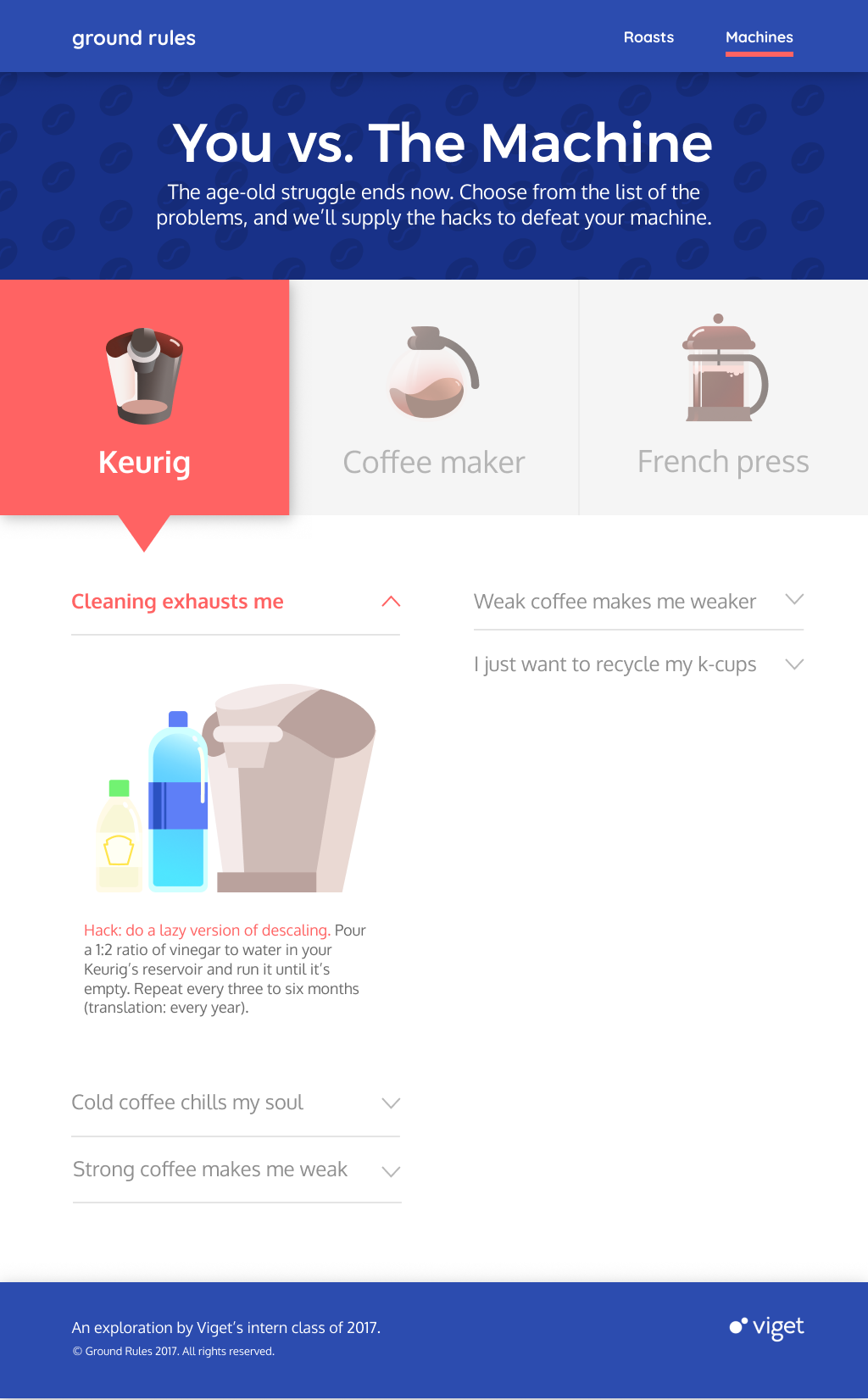
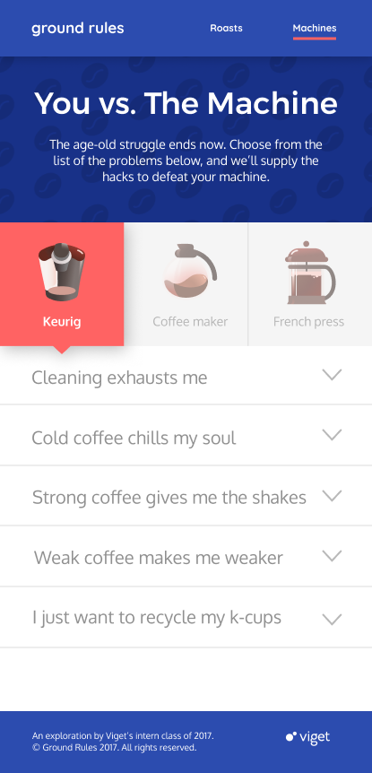
      b. Addressing problems in function they encounter with their coffee-making machines. 
Based off of these results, we realized there existed the opportunity to improve others' experience of their daily coffee  -- not by teaching them to become a barista or by pushing them to buy expensive coffee equipment, but simply by providing roast recommendations and solutions to common machine problems. Small tweaks in the way users made coffee with their existing equipment can make a big difference: this is the driving force behind Ground Rules. 

Solution Concept & UX

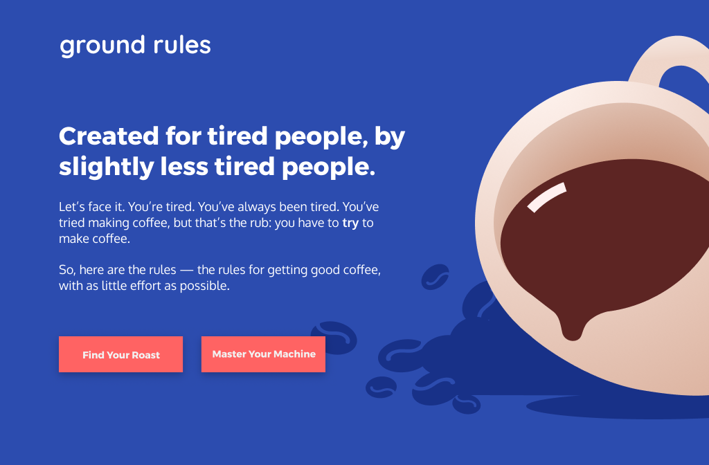
Because our target user base featured mainly people who were tired and exasperated with the struggles of making their regular source of caffeination, our solution tackles the tedium and exasperation of finding new coffee experiences via an interactive, responsive web app that enables users to explore new coffee types and learn new ways to enhance their current coffee machine performance in an interactive manner. With our solution: 
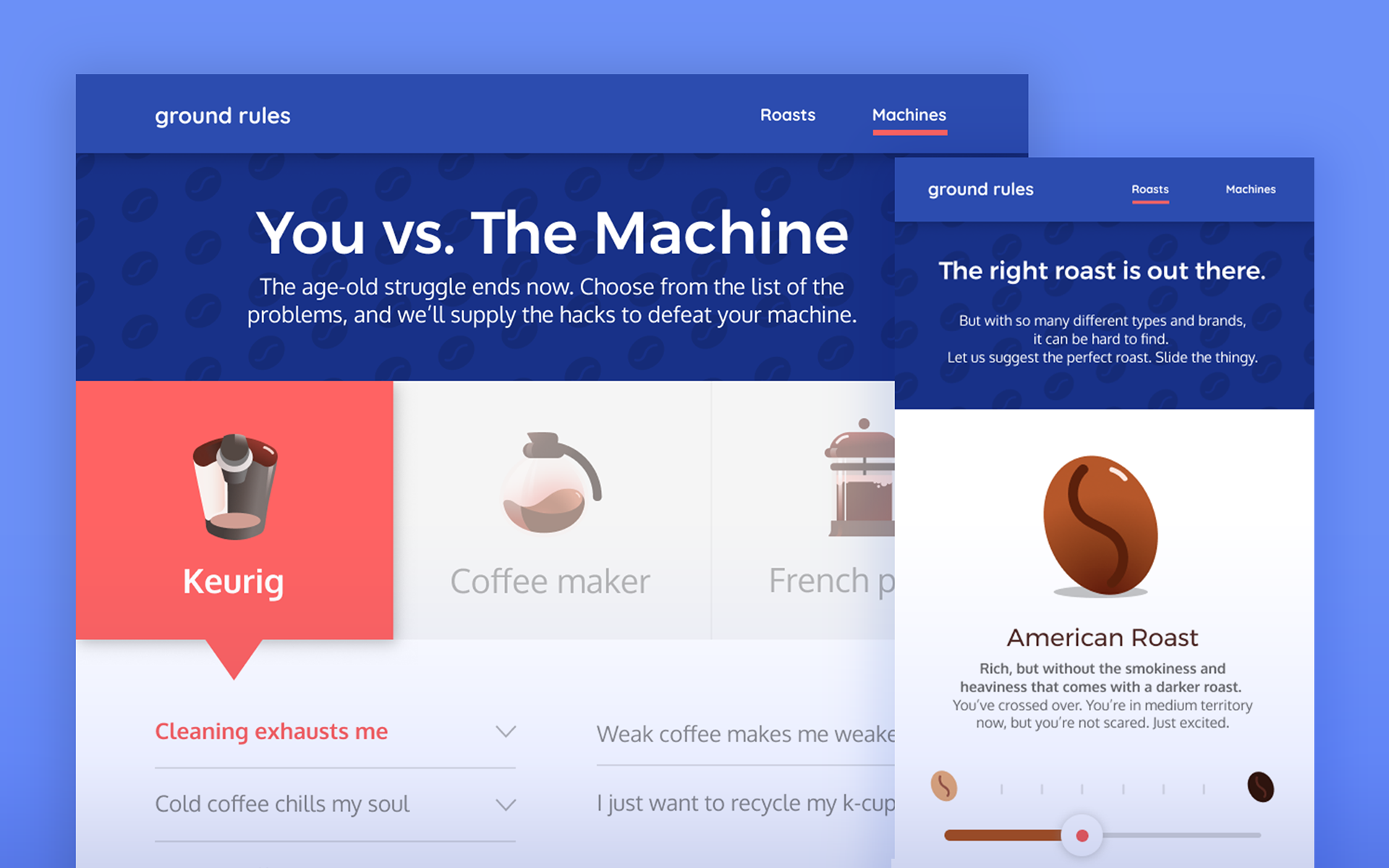
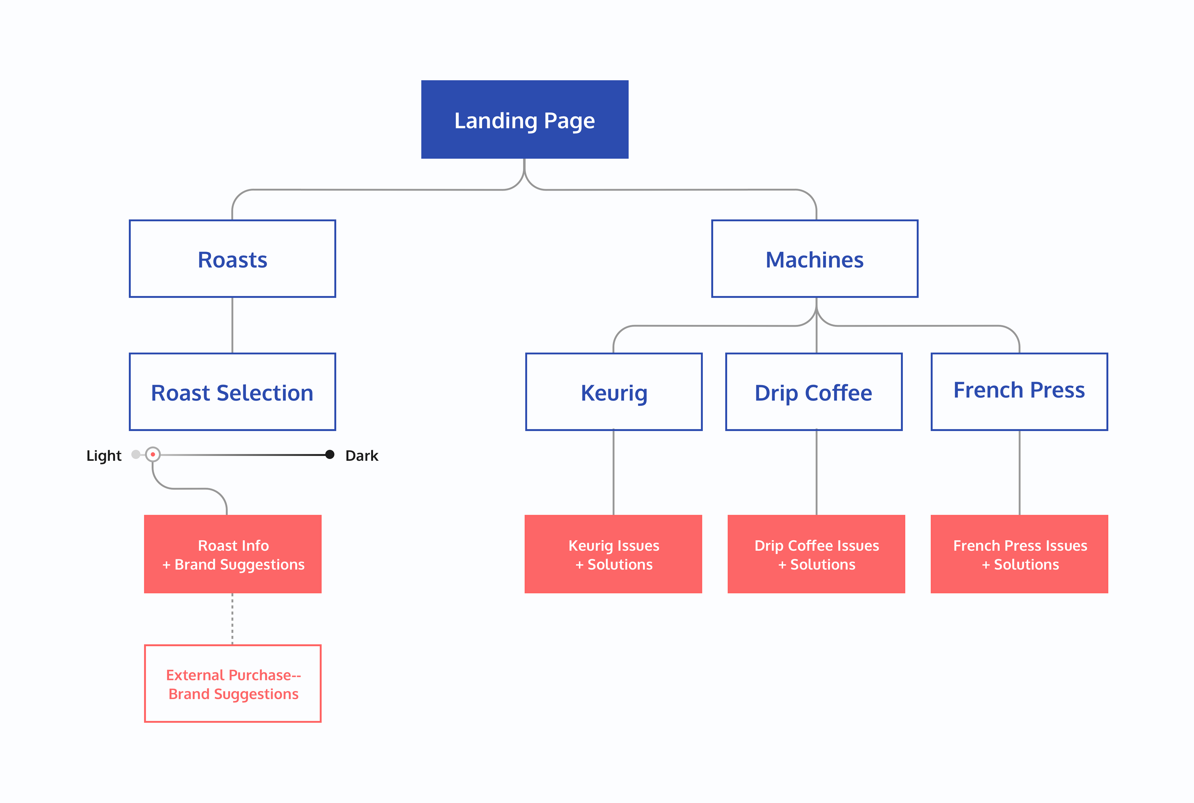
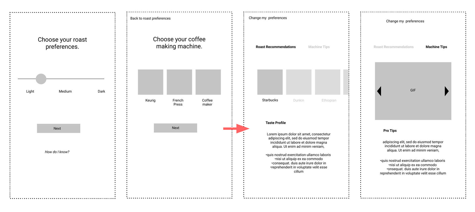
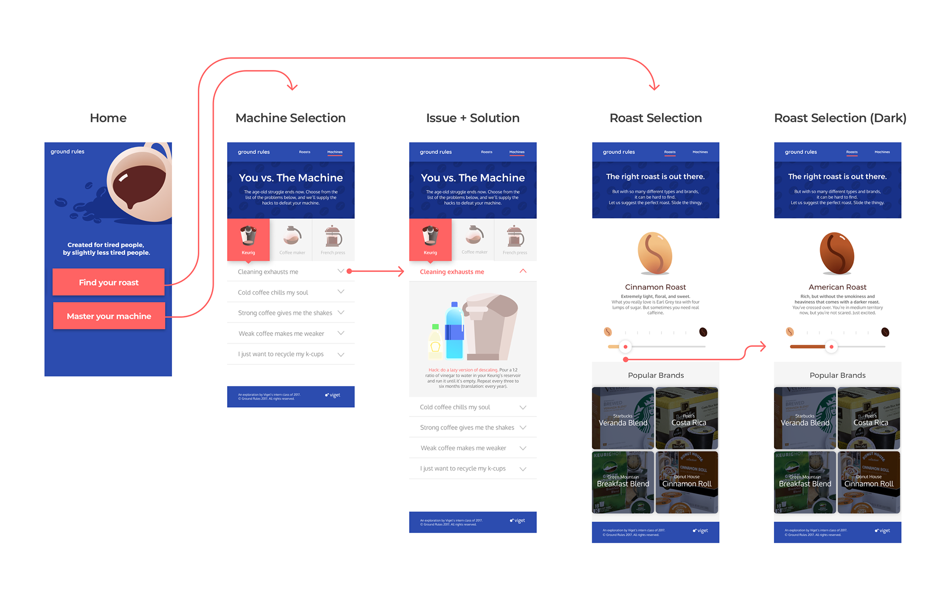
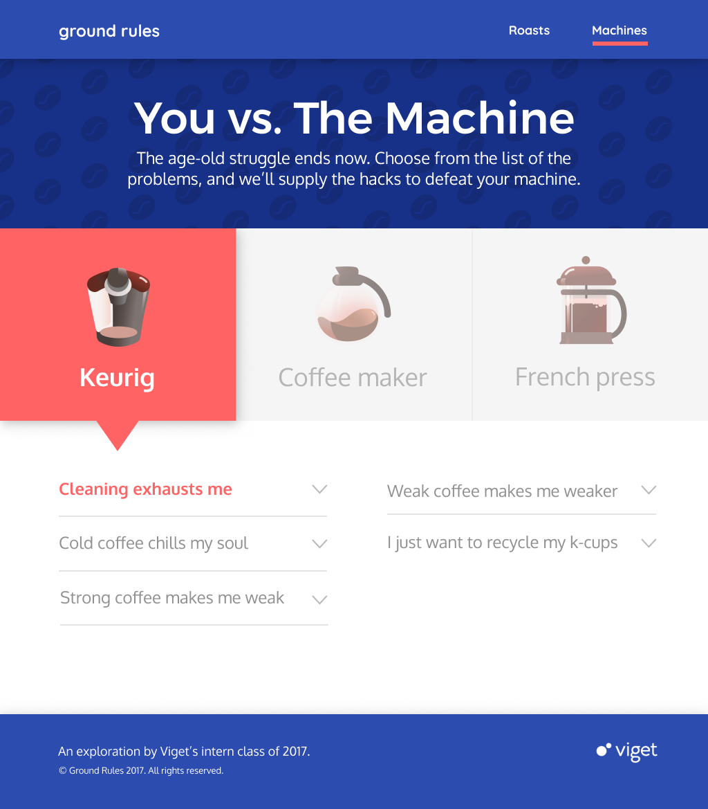
- Users are able to easily choose and switch between what they want advice on: Roasts vs. Machine fixes. 
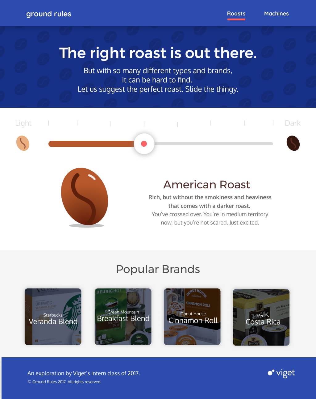
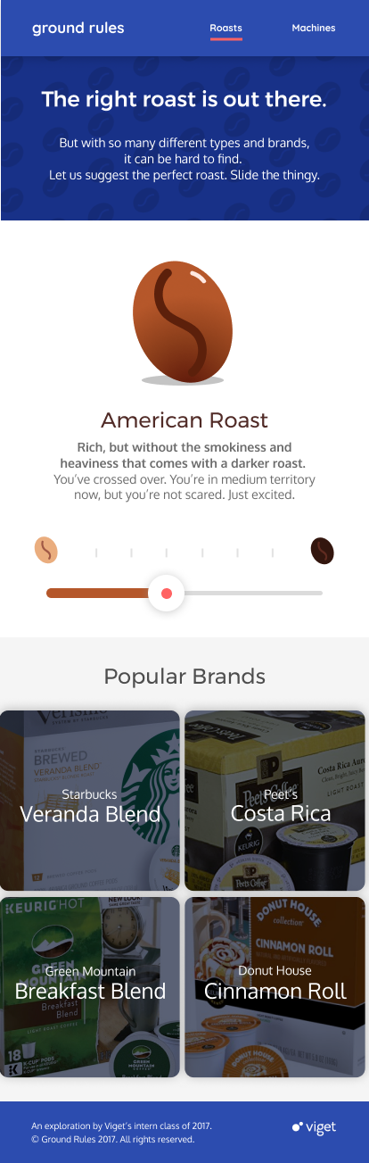
- Users can simultaneously explore new roast types while identifying their personal favorites using an intuitive slider that provides information on roast types from lightest to darkest. Each roast type on the slider provides not only information on the flavor profile and type of the roast, but also provides actionable suggestions for specific brand types that users can purchase. 
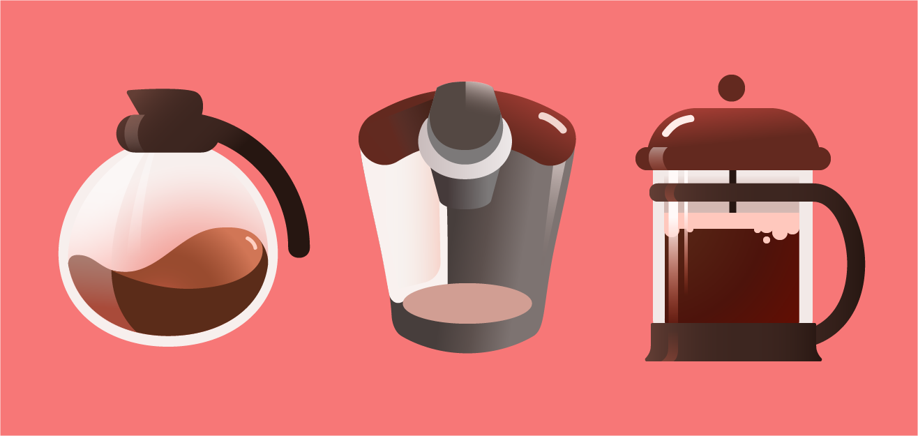
- The most common issues for the three most popular coffee machine types -- Keurig, French press, and Drip coffee -- are paired with actionable solutions users can take to fix their current issues. 
- A built-out backend content management system allows us to continuously update the site with info on more roast brands, machine types and issue fixes.

Our next step was prototyping -- we began by mapping out how users would navigate the key features of our solution in a UX flow overview. 
From there, I worked together with the UX designer on my team to develop low-fidelity wireframes for testing. 

Initial mobile wireframes for Ground Rules.

At first we worked on a flow that would first require users to input their coffee roast preferences and type of coffee machine before showing them information. Testing indicated that users wanted to choose the main issue they wanted to address (picking bean types or solving machine problems) from the start of their interaction with the product. Furthermore, many users didn't really know their roast preferences, so it didn't make sense to require them to input information they didn't know themselves. From here we changed the flow to allow users to select the problem they wanted to address from the landing page, as well as to facilitate exploration of different roast types without having to input their preferences first. 
While we worked on the UX flow of the product, I set about defining the visual/branding identity. 


Final color palette and type choice for Ground Rules. The main concept behind the colors was to offer a visual brand that breaks away from the overwhelming browns and warm colors traditionally characterizing coffee-related products, yet is still refreshing and easy to understand. Because our strategy focuses on ease of use for tired users, I chose to use this bright coral color as the main highlight color to clearly delineate actionable areas of the user interface and branding. The blue is meant as a calming, yet refreshing color that strays away from the monotony of everyday caffeination. 


Core UX flow of Ground Rules in mobile format.


Desktop landing page for Ground Rules. The choices of navigation from the landing page are simple: explore coffee roast information, or find ways to improve your coffee with the machine you currently have. 

High-fidelity desktop and mobile mockups of both Roast Selection and Machine Selection flows of the product. 

I also had the opportunity to bring more delight to user interactions with Ground Rules using illustration and animation, which would help user understanding of advice, as well as emphasize the voice we had chosen to take with with product. Illustrations were all done in Adobe Illustrator, and animations were mocked up in After Effects. 


The full lineup of coffee bean roast types from the "Roast Flow" portion of Ground Rules. 


Illustrations for the "Machine Flow" component of Ground Rules. 

Left to right: animations for the 404 error page, "Washing French Press" solution, weak coffee issue, and K-cup waste issue. 

reflections and next steps 
This was a great opportunity to collaborate with a full team consisting of front-end, back-end, UX and copywriters to design and build out a digital product from start to finish. I was able to learn the communication skills required for working with such a wide variety of roles and really understand and develop my relationship with the developer roles on my team, as well as test out my user research skills.  
Moving forward, I'd like to continue to test out the usability of the product on more users, as well as explore more ways to present new information to users in efficient and interactive ways -- incentivizing users learn new content in a way that fits into their busy lives is a unique challenge that I'd love to continue to investigate in future projects. 
Back to Top